|
This page contains a series of vertical bar graph examples
illustrating the available varieties and options.
These examples all use ploticus's proc bars,
which renders bar graphs, error bars, and bar segments, in vertical or horizontal
orientation. Clickmaps are supported
for bar graphs.
See also the examples for
bars prefab,
chron prefab
and
dist prefab.
Example 1
stock2
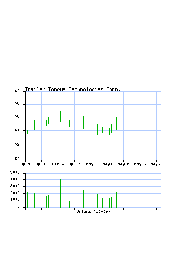
A stock price/volume display. The bars show low-high range
for the day (segmentfields attribute), and have left tics to
show opening price, and right tics to show closing price.
Example 2
bars2
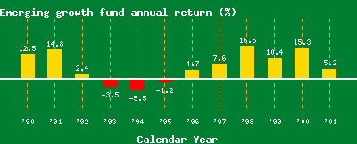
In this example, values less than zero result in red downward bars.
The positive bars are done first using orange and then the negative bars
are done using red.
The values are displayed near the ends of the bars using the
showvalues option.
Example 3
hitcount
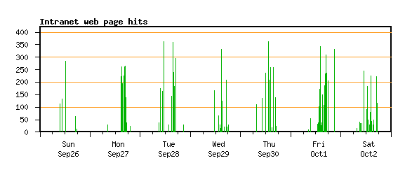
A histogram example, which utilizes datetime scaling as well as
some of ploticus's data filtering / processing features.
Example 4
bars3
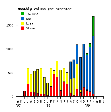
Stacked bars. These show magnitude of several components as well
as the sum of the components.
proc bars
is executed four times, first to render bars for Steve, then for Lisa,
then for Rob, then for Takisha.
The stackfield attribute indicates what data field(s) should be used
to raise the bars. For a full-page version of this see
vermonth.
Note: stacking cannot be used when components are a mixture of
positive and negative values.
Example 5
students
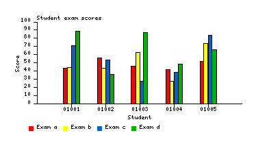
This example allows a variable number of datafields, and the number
of bars per cluster (as well as the legend) follows the number of datafields on input.
Example 6
bars5a

Stacked, clustered bars.
These may be useful in displaying multiple variables, groupings, and instances.
proc bars
is executed once for each color of bar, using
the stackfield and cluster attributes to control position.
bars5 is another example of stack clustered bars.
Example 7
snpmap1
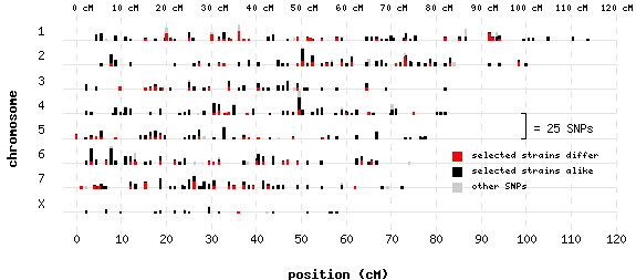
This example used
proc scatterplot to generate the bars
rather than proc bars. Proc scatterplot
can cluster points to string them upward to form little
bars. This is a convenient way to show multi-tiered
frequency distributions. The multiple colors are achieved by overlaying
several subgroups of data of diminishing size.
Example 8
propbars2
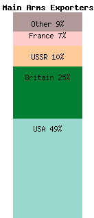
Here, the bar segments represent proportions of a whole.
The stackfields attribute is used to position bars.
See also propbars1, a horizontal example
of proportional bars.
Examples of bar labeling
bars6

Here, bar labels
are formatted using the labelword attribute
to show dollar amounts.
bars7

Longwise labels, formatted to show dollar amounts.
bars8

Individual components of a stacked bar graph
labeled with values. Label position is adjusted downward
so that label is within bar, and a lighter-colored backing box is
used so that the labels are visible.
|


