This page contains examples
illustrating heatmaps, density grids, and similar displays.
These examples all use ploticus's
proc scatterplot.
The data can be distributed into bins, or instances counted.
The colors of the data points
are controlled from the data, using the legend-driven
technique. Also, the data points can be mapped using a
clickmap.
Colors may be mapped directly to
to data values, or it is also possible to have
proc scatterplot count instances and determine
the colors from the count.
See also the heatmap prefab examples.
Example 1
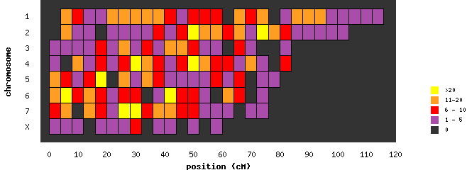
heatmap1

Cells are displayed as rectangles.
Example 2
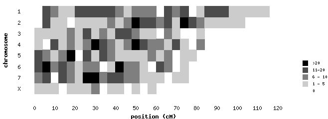
heatmap2

Using a gray scale.
Example 3
heatmap2

A 2-D distribution of Z scores, with measured values shown.
Example 4

Cells are displayed as circles. This plot has an accompanying
clickmap; try clicking on
the circles to demonstrate.
Example 5
colorgrid2

Another example.
|


