Script examples gallery - Real world examples |

Version 2.41 Mar2009
Scripts
| |
|
Manual page for Script_examples_gallery_-_Real_world_examples(PL)
|
These page contains some real-life examples where ploticus
helped to produce paper-based reports, posters, and slides.
(Data may have been altered to protect confidentiality.)
|
Example 1 - Web
mouse
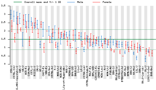 
This is a comparison of measurement values of many different inbred
strains of mice, for a certain scientific measurement.
In the larger plot,
two bars (red for female and blue for male) are shown for each strain;
the middle tick is the mean, and the bars extend to +/- the standard error.
The second, smaller plot is also produced by the same script.
It shows a histogram of the distribution of measurement values.
More info on producing web-based graphs
Example 2 - Web
stock
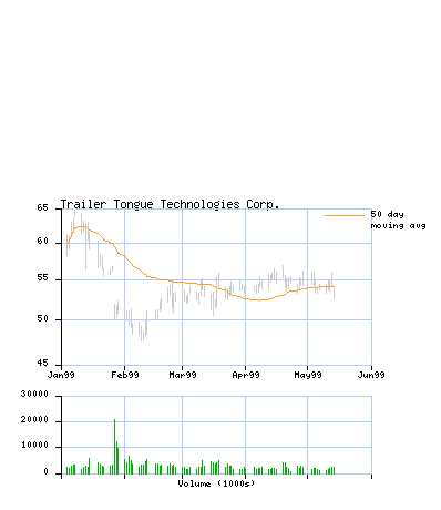
A stock price / volume display using historical data downloaded from
quote.yahoo.com in sreadsheet or .csv format. Here is a
variation.
More info on producing web-based graphs
Example 3 - Web
dmag

A user-contributed example having to do with managed health care.
Example 4 - EPS graphic
spence1_rt
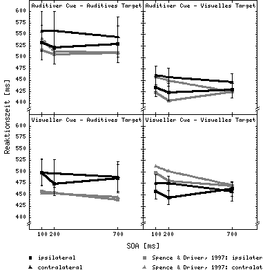
A user-contributed scientific example. Ploticus can generate EPS
vector graphics that most document and word processing systems accept,
and that are appropriate for pre-press work.
Example 5 - Paper
timely
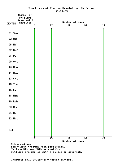
In this example, horizontal rangebars are used to compare the timliness
of problem resolution between a number of different centers.
Example 6 - Slide
errbar5

A slide for presentations.
Example 7 - Poster
(The following layout may not be correct if your browser window is too small)
propbars1
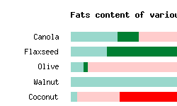
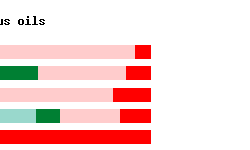
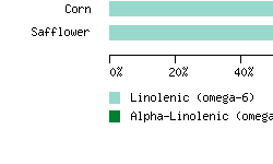
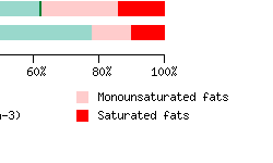
Posters for scientific meetings and presentations require
larger size. Color is desirable, but not required.
ploticus can generate posters using standard printers
and paper.
More info on producing posters
Example 8 - Paper
distrib
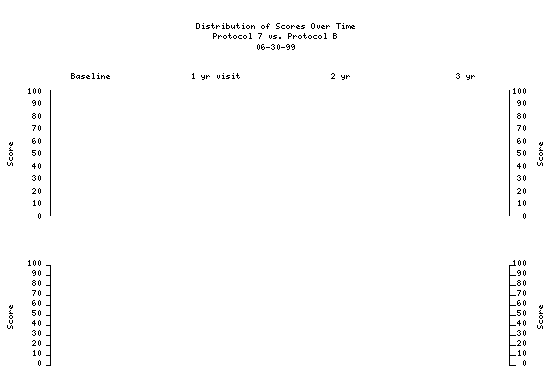
This elaborate example uses both histograms and rangebars to look
at the distribution of scores. One data file is used, and ploticus
computes the distributions for the histograms, and the medians/percentiles
for the rangebars. Histograms are suppressed when N is less than 10.
Example 9 - Paper
multiscat
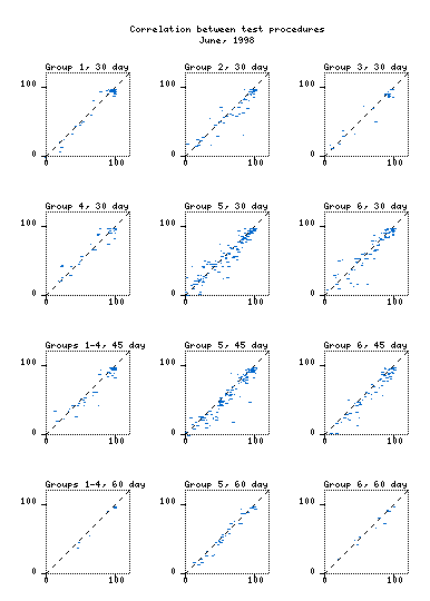
Here, a series of scatterplots are produced from one
data file. Each #proc scatterplot has
a select option that selects various sets of records.
More info on producing paper-based graphs
Example 10 - Paper
errbar1
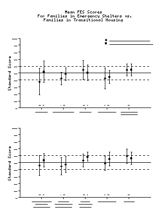
This example compares various quality-of-life attributes for two sets of
persons who are in transition from homelessness. It uses categories, and
#proc catslide to display pairs centered over the categories. The points,
which represent averages,
are rendered using #proc scatterplot; the error bars, which show the standard
deviation, are rendered using #proc bars.
More info on producing paper-based graphs
|

data display engine
Copyright Steve Grubb

|


