This page contains a series of scatterplot examples
illustrating the available varieties and options.
These examples all use ploticus's
proc scatterplot.
Clickmaps are supported for scatterplots.
See also the scat prefab examples.
Example 1
scatterplot1
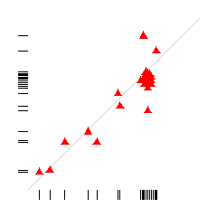
This example shows the correlation between two variables.
The 1-D distribution for each variable is shown along each axis.
Duplicate data points are offset slightly (the cluster
option) to show duplicity.
Example 2
scatterplot10
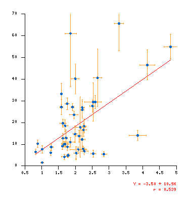
Correlation scatterplot showing regression line and error bars on the points.
Example 3
scatterplot8

This illustrates how multiple points can be displayed using the clustering option.
Size, color, "transparency", and shape of the points are all user-controllable, as is
the distance of clustering.
Example 4
scatterplot3
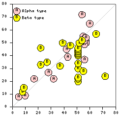
Points may be marked with a variety of geometric symbols and characters/text,
in a variety of colors. Point symbols may be solid (filled) or transparent
(not filled).
Example 5
scatterplot3a
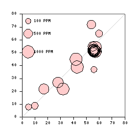
The size of point symbols may be driven by a data field, allowing display of
a 3rd variable.
Example 6
scatterplot5
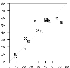
An example where data text is shown instead of a point symbol.
This may be useful in identifying outlier cases.
Example 7
qual
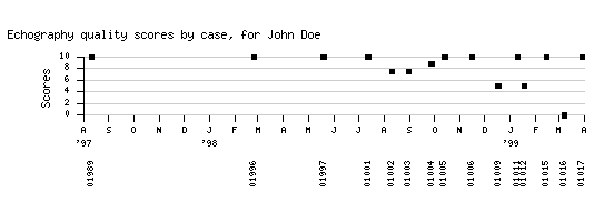
An example showing scores over time. Case identifiers are shown
at bottom using a second invocation of proc scatterplot.
Example 8
multiscat
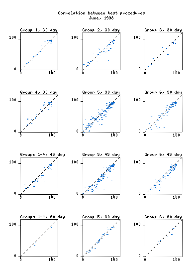
A full-page example showing an array of scatterplots.
Single variable (1-D) distributions
Example 9
scatterplot6
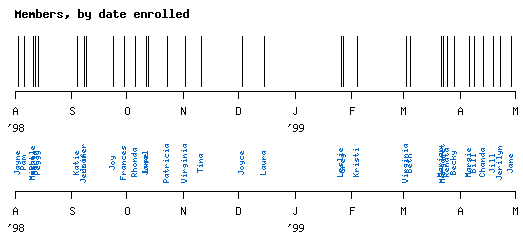
A 1-D scatterplot showing instances over time. Instances are denoted by
lines in the top panel, and by names in the bottom panel.
1-D distributions usually work better for scattered data points; when there is
significant duplication a histogram (bar graph) is more effective.
Example 10
beeswarm
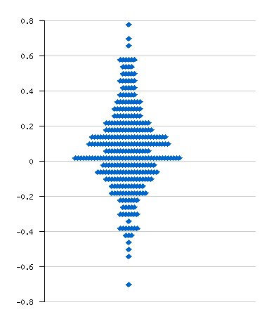
A beeswarm-like distribution plot.
In this example proc scatterplot clustered the bars horizontally.
|


