This page contains a series of horizontal bar graph, timeline,
and proportional bars examples
illustrating some of the available varieties and options.
These examples all use ploticus's proc bars
with the horizontalbars option.
Clickmaps are supported for
horizontal bar graphs.
Example 1
hbars1
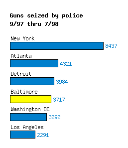
This example shows how horizontal bars
can provide a compact format for displaying
comparison data, especially when the
category labels are long.
It also demonstrates how selected bars may be highlighted
by using a different color.
Example 2
hbars2
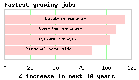
Here, the category labels are within the bars.
Example 3
hbars3
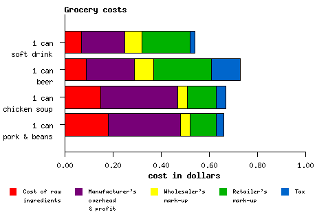
Stacked horizontal bars.
Example 4
hbars5
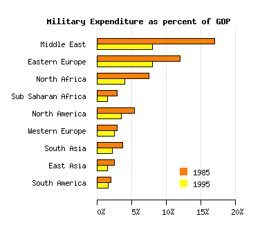
Clustered horizontal bars.
Example 5
hbars4
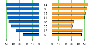
Reflected bar graphs. These are sometimes used to compare two sets of values.
I personally don't like these, except perhaps
when the number of categories is large, or when the
nature of the data lends itself to such a display;
I would prefer two-bar clusters.
Floating segment bars and timelines
Floating segment bars can represent time intervals, genomic regions, etc.
See also the EasyTimeline
package by Erik Zachte / Wikipedia, which utilizes ploticus.
Example 6

Example 7
timeline1a

In this example, bars are used to represent time segments, showing
the phases of a project. Use the segmentfields attribute.
Example 8
timeline2

Another time line example. proc scatterplot was used to
render the target date points.
Example 9
sess2
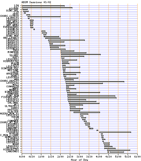
Another time line example showing login sessions for one day.
Example 10
clickmap_time2

An example of a timetable. This also illustrates the use of
clickmaps with bar graphs.
Try clicking on any TV show box above..
Proportions
Example 11
propbars1
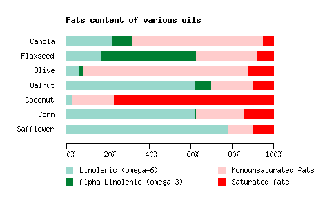
Here, the bar segments represent proportions of a whole.
The stackfields attribute is used to position bars.
This is the same type of look that a pie graph shows, but
bars are usually more compact.
See also propbars2, an example of
vertical proportional bars.
|


