|
Ploticus includes an array of options for
defining aspects such as the plot area and the creation of axes.
Data scaling options include simple linear, log, date, time, datetime,
and categories.
Basics
simple2
Area definition
Before plotting data, a scaled area must be defined.
proc areadef is used to set up a plotting
area, and to define its size, scaling, and location on the "page".
Axes
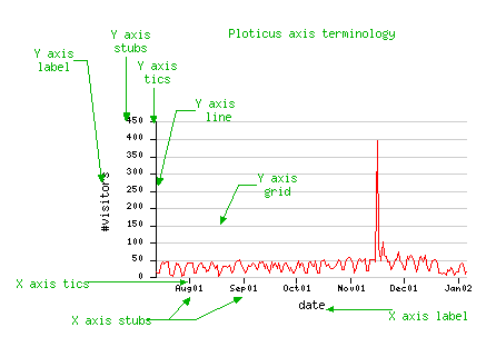
Next, proc axis
is invoked to render the X (horizontal), and Y (vertical) axes.
A typical axis is a line with some number of regularly placed
marks called tics, each of which has a label called a stub.
The axis often has a descriptive text label nearby.
In this example, date stubs appear in the X axis, in an increment of 1 month
The Y axis is linear numeric with incremental stubs every 50 units.
Linear numeric scaling with regular stubs

Generated incremetally (numeric).
The min and max may be
automatically determined
or specified manually.
For the stub increment to be automatically determined, just use: stubs: inc
Self-locating stubs

"Self-locating stubs" are stubs that contain their own location.
By using these, stubs and tics may be placed at irregular locations.
The underlying scale type is usually simple linear, but it can be any type.
Self-locating stubs may be...
given in the script on multiple lines
taken from a data field
taken from an external file
Other examples:
lineplot3
hbars4
Log scaling
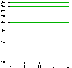

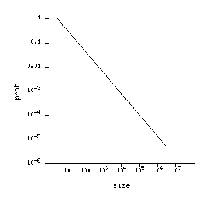
Log scaling examples.
Scale by category

The categories scale type allows non-numeric tags to be plotted
directly. This scale type may be useful when rendering scatterplots,
and bar displays (for bar placement), etc.
Categories do not have to be used in order to make text stubs;
often stubs, bars, etc. are placed sequentially, i.e. "as they fall", with
the underlying scale type being simple linear numeric, and this is often
satisfactory.
However, the use of categories as the scale type ensures that
data are being displayed at the correct location.
More examples:
timely
timeline1
timeline2
timeline3
Sometimes your data are categorical but do not contain the category names.
You just want the first case to be plotted at X = 1, the second
at X = 2 and so on. To do this, just use ordinary linear scaling,
and specify the stubs literally. When rendering this way you should
double check to make sure that data and stubs match correctly.
Literal stubs may be specified in one of these ways:
given in the script on multiple lines
given in the script as a list
taken from an external file
(By default literal stubs begin at X=1
or Y=1, rather than at 0, since this is usually the desired result
for bar placement, etc. This may be overridden using stubrange: 0)
Date scaling


The date scale type allows date values to be plotted directly.
Like other time measures, dates are almost always plotted against the
X axis. A wide variety of date notations are supported.
More examples:
timeline2
sa4a (same as sa4 except for year tics)
year divided into quarters
Time scaling


The time scale type allows time values to be plotted directly.
A variety of different time notations are supported.
More examples:
timeline3
Datetime scaling
The datetime scale type allows time values to be plotted directly
across multiple days.
A datetime datafield consists of a date value and a time value connected
by a dot (.). The date and time values may be in any of the supported
plotting formats.

hitcount
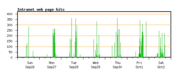
Another example:
hitcount2 has time increments along x axis
Datetime scaling, with time windowing
Sometimes it is desirable to show only portions of each day, when showing
the entire 24 hour day would be too much. Examples of this include a work
day or a trading day. datetime scaling allows you to do this-
you can indicate the time range for each day at the end of the datetime
keyword. For example, datetime9-17 would show only the hours
from 9:00 to 17:00 for each day. See scaleunits
for more details on using datetime with time windowing.

Example:
hitcount3 demonstrates time windowing
Other axes rendering capabilities
Multiple areas per "page"
sa2

Any number of plotting areas may be rendered on a page.
(more of an issue when rendering onto paper). Each has its
own proc areadef.
Broken axes
Broken axis plots, where an axis is broken to allow compact
display of extreme value(s), may be done.
(It requires
manual "tweaking" and cannot really be automated.)
See the example brokenaxis.
Axes in unusual places
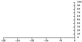
Although Y axis is usually done on the left, and X axis
along the bottom, axes can be placed anywhere.
Overlay of multiple scales
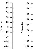
Two or more coordinate systems may be overlaid, using multiple
#proc areadef invocations that plot into the same rectangle.
Here's a full-scale example with two Y axes.
Overlay of multiple axes

This example has two X axes overlaid, in order to do two different
systems of grid lines. Try this strategy if you have more complicated
requirements for tics, stubs, or grid lines.
Formatted numeric axes

European decimal notation.

Financial notation.
Clickmap support
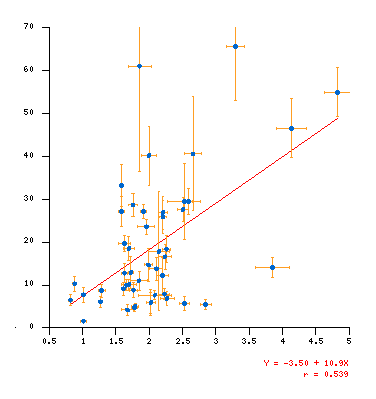
Clickmaps are supported for the plotting
area, in either one dimension or two. Try clicking on the above image.
|


